
Delivery visuals
Food photography for delivery apps
How restaurants and delivery catalog teams should prepare food photography for app listing cards, item pages, and merchant onboarding.
Food photography for delivery apps should prioritize accurate dish visibility, mobile-friendly crops, consistent listing quality, and review-safe files over decorative styling.
Design for the listing card
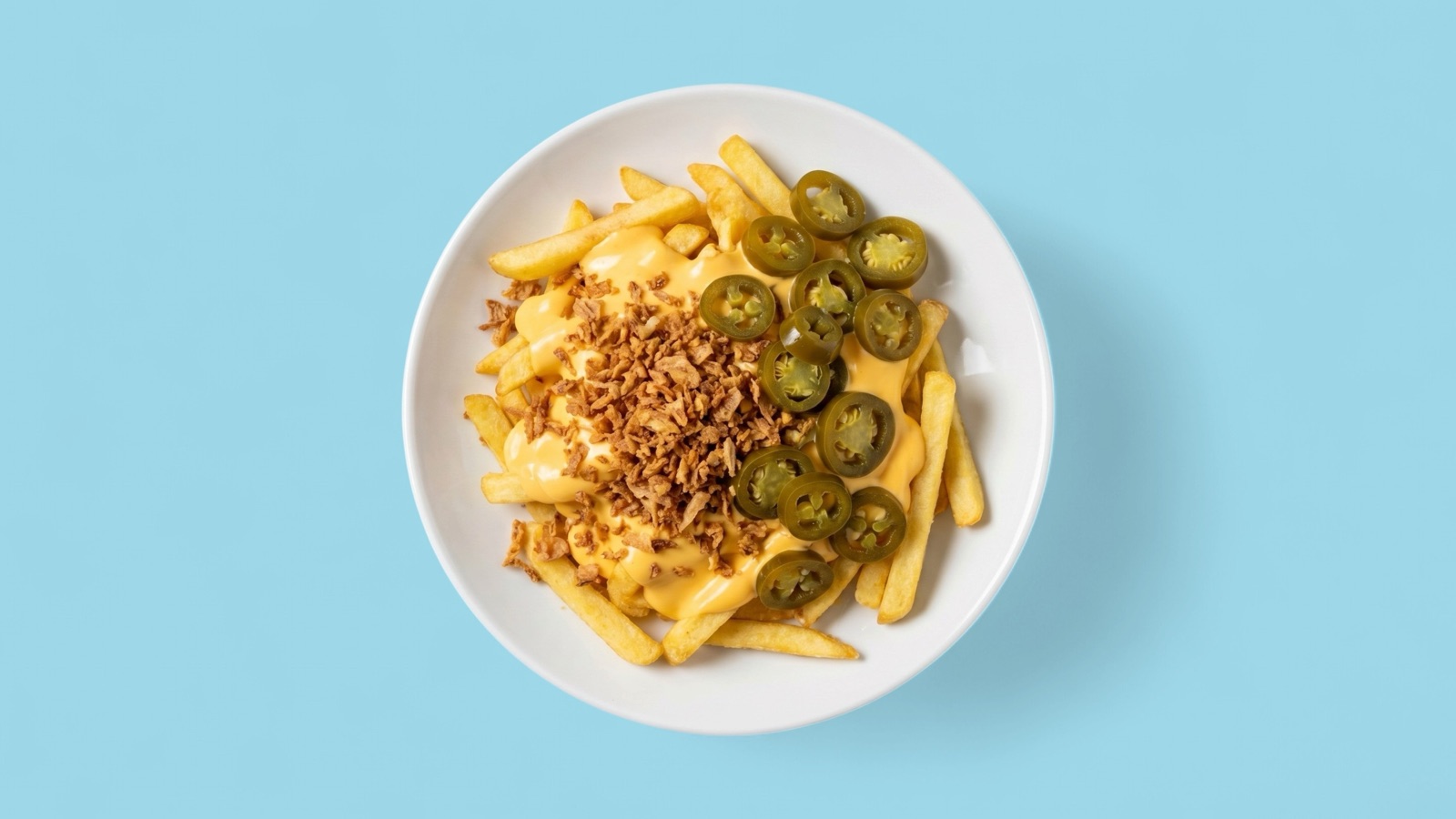
Delivery app customers often make decisions from small mobile listing cards. That means the image has to communicate quickly: what the item is, what it contains, and whether it looks trustworthy enough to order.
Highly styled food photography can work for campaigns, but delivery listing images need practical clarity. Crops that are too tight, dark, or decorative can make the item harder to understand.
Avoid review friction
Delivery platforms can reject or suppress weak images when they do not meet requirements. Teams should check files before upload for clarity, accurate item representation, distracting overlays, watermarks, and unsafe crop ratios.
A review-safe image is not only technically acceptable. It also matches the real dish, so customers do not feel misled when the order arrives.
- Use one clear dish per item listing when possible.
- Avoid heavy text overlays or promotional graphics.
- Keep ingredients and portion expectations believable.
- Export channel-ready crops from an approved master image.
Scale the workflow
One restaurant can review delivery photos manually. A marketplace or multi-location group needs a repeatable workflow that scores image quality, routes weak assets, and keeps approved images organized by item.
Enhancement fits well when the source image is accurate but needs clarity, crop, or consistency improvements. It should not be used to make the item look like a different product.